Building a Design System to elevate data analysis
Challenge: A civic housing data tool had strong underlying data but no design system, no validated understanding of its users, and no visual language credible enough to support fundraising.
My Role: Lead product designer from discovery through execution. I owned user research, information architecture, the full design system, the Figma component library, and the Lovable prototype.
Team Structure: Lead Product Designer (me), Engineer, Product Manager
Impact: A complete design system, working prototype, and launched feature updates - used to support fundraising conversations for the OpenRent Initiative to expand to new locations.
Summary: OpenRent had strong data and a clear mission, but its interface wasn't meeting users where they were. I started with research to understand who was actually using the product and what they needed, then rebuilt the UI from the ground up — designing a component library, improving search and filter interactions, and introducing new features like map breadcrumbs, scannable hover cards, a detailed information panel, and a comparison panel as a future-facing primitive. The result gave the team a built product they could show investors with confidence.
HMW make spatial data legible to non-technical advocates while preserving what researchers need to trust it?
the Discovery
The first assumption I tested was whether researchers and advocates needed different products. They actually needed the same data but framed two different ways.
I conducted user interviews to surface what each group actually needed in practice. The finding that changed everything: researchers and advocates didn't disagree about the data, they disagreed about the framing and context. Researchers wanted comparable data - where does this neighborhood sit on the full spectrum and how does this building compare to the neighborhood? Advocates wanted categorical clarity - is this affordable, mixed-income, or market rate? They wanted to be able to drill down into the details of each property. I was able to navigate this through information hierarchy across unit hover cards, detail panels, and a comparison panel being intentional about the product real-estate in a way to future proof the design.
THE DESIGN - Brand
Before building components, I established the foundational constraint the whole system would rest on: a strict separation of color use. The early prototype had brand colors and signal colors collapsing - for example coral being used simultaneously as "this is our visual identity" and "rent is rising here." When everything is brand-colored, nothing read as a signal.
The four categories, enforced throughout:
Brand colors (Dry Sage, Soft Peach, Vibrant Coral, Wine Plum, Deep Mocha) - identity only, used sparingly in UI
Signal colors (red rising, green falling) - data values only, never decorative
Map choropleth colors the five-step sage-to-coral scale, used only on the map canvas that aligned with the brand colors without competing
Typography followed the same discipline: Junicode for editorial text and place names, Work Sans for UI labels and body, Roboto Mono for data values. The mono choice for data values is both a legibility decision (tabular figures align correctly) and a semantic one - it signals "this is a number to compare, not a label to read."

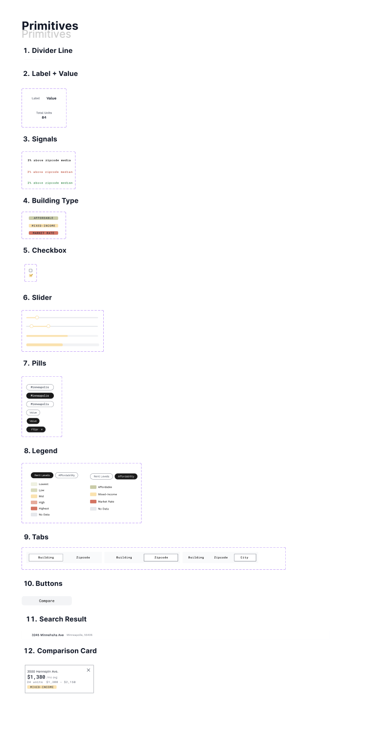
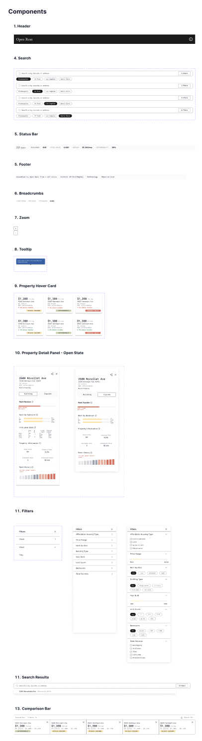
The Design - System
The Figma component library was built from the smallest unit outward: Divider → LabelValue → Signal → Badge → IconLabel → Checkbox → Toggle → Slider — then assembled into Hover Card → Property Detail Panel → Filter Panel → Search Bar → Comparison Bar.
The sequence mattered. Building primitives before assembled components meant every downstream component inherited consistent spacing, states, and color rules from the foundation. When a primitive changed, everything that used it updated. The filter panel is the clearest example of where this paid off.
The prototype wasn't just for users, it was for investors. Every design decision carried a second audience: people evaluating whether this product was real, well-considered, and worth backing.
The design system did two things at once. For users, it made the product feel credible and navigable. For investors, it demonstrated that someone had thought through the visual language, the component hierarchy, the color rules, and the information architecture at a level of rigor that matched the quality of the underlying data.
The comparison panel (designed as a primitive and built out in the system) was the clearest example of this dual purpose. It wasn't shipped yet, but it was fully specified. Investors could see exactly where the product was going without having to imagine it.
The figma design
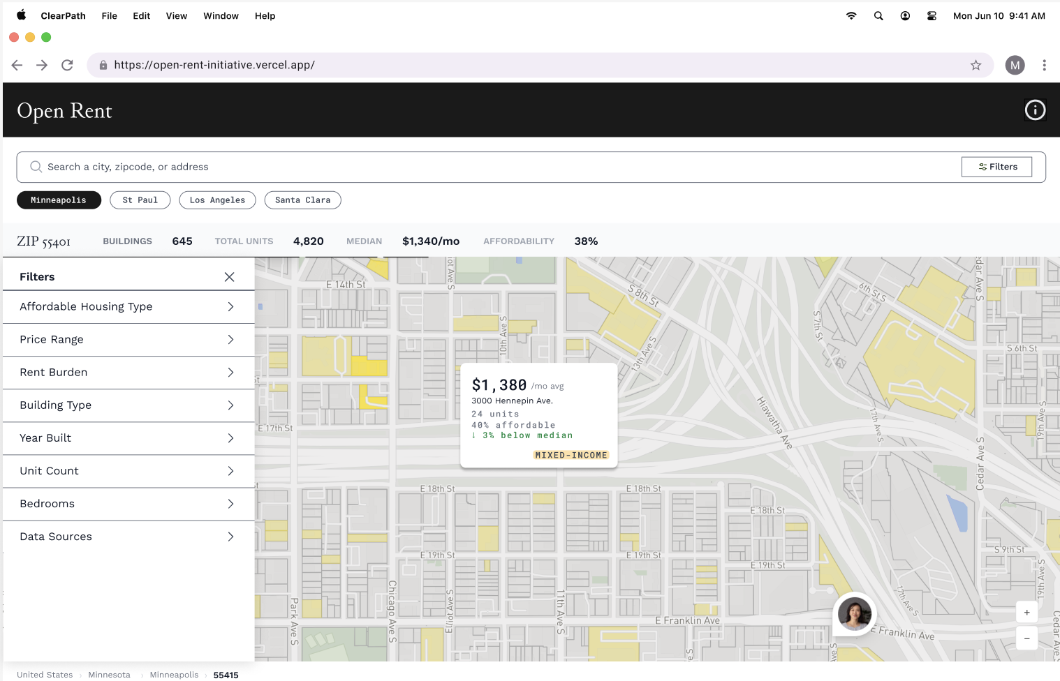
Hover cards surface the most scannable facts about a property or neighborhood - name, rent figure, burden signal, and affordability category - on hover. Researchers scanning twelve buildings across a neighborhood don't have to open a panel to triage; they can read the relevant data inline and move on.
The filter panel controls the map without leaving it. It was one of the decisions that looked small and had layout-wide consequences. Filter panels are workflow decisions, not aesthetic ones. The right width determines whether a user can actually navigate the data or is fighting the UI to do it. The right data levels allow each user to navigate the data quickly and effectively. Filters became the make it or break it for the whole experience.
These features launched first with the detail panel launching next and the comparison panel soon to come. The order was important to be able to first clearly navigate the data, then validate the information, and finally aleviate cognitive load through visual analysis.